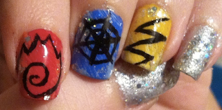
Those are the finished nails in two diffrent lights. Cute, aren't they?
What inspired me though, was the book cover of Volume 7 of Death Note.
(Apologies for the picture being upside down. I'm too lazy to rotate it.)
I definitely wanted a beige background, and I figured using the newspaper technique for the lettering would look amazing, so that's where I started.
I applied a light brown polish, and sponged on a very faint, quick layer of a shimmey beige, for texture. Then I applied a matte top coat, because the ink sticks better to it. At least I've heard that somewhere, and it came out well so I'm gonna stick to it (haha, see what I did there? No? ... Okay....).
What you do is, cut out pieces of a newspaper, bigger than your nails, and pick it up with a tweezer. Soak the piece in vodka until it's wet, takes a few seconds. Then apply it over your nail. If you want the text going a certain way, pay attention. Then, what I did was, take a cotton round, dip a corner of it in vodka, and then press the paper on the nail with the wet cotton. After about 10 seconds, I dipped the cotton round again, and pressed for another 10 seconds. Then I peeled the paper off carefully, and the ink was stuck. Sometimes, if you press too hard, a piece of the paper can stick to your nail. It happened on my index finger. If you're careful, you can pull this off with a tweezer. If it's too tiny to be pulled off, don't panic. When you apply a top coat, it'll go invisible.
Here are my newspaper nails! Of course this is just the background.
I continued with a dark green acrylic paint, mixed with a tiny bit of brown. I made small vines around the edges of my nails. Then I took a beige (white and brown), and mixed it haphazardly with a red (crimson red and brown). I wanted streaks on my brush, which gives the flowers more dimension. I call this the Robin Moses Technique.
I made a few lumps on each nail, over areas where the green vines were too thick or just ugly.
Then I mixed (fully, this time), a tiny bit of the red with a lot of the beige, to make a lighter shade. I used this to make C shapes around my blobs of color. Tiny in the middle, bigger at the edges. I tried to put them over areas of streaks that weren't good, or where the paint was fully mixed and didn't have streaks at all.
Finally, I added some beige to the dark green I used for the vines, tried to make it streaky, and put in some simple leaves. And when I top coated, what happened?
Ugh. I still don't know if it's Seche Vite that's being a b*tch, of if it's my acrylic paints disagreeing with the chemicals of top coat. After seeing this on my thumb, I tried using a matte top coat on the rest of the nails. They still shifted colors, but not as much. I was very annoyed, but there was nothing to do about it.
The color change makes them look a lot more antique, and when I took a step back and looked at the finished product, I realised that it didn't remind me of Death Note at all. However, my next design is going to be a bit clearer..
I still love them, even though they didn't turn out as planned! And I posted this on Robins fanpage, and I'm getting a lot of likes, which I am not used to. It's nice to have people appreciate your work!
Tialiq


